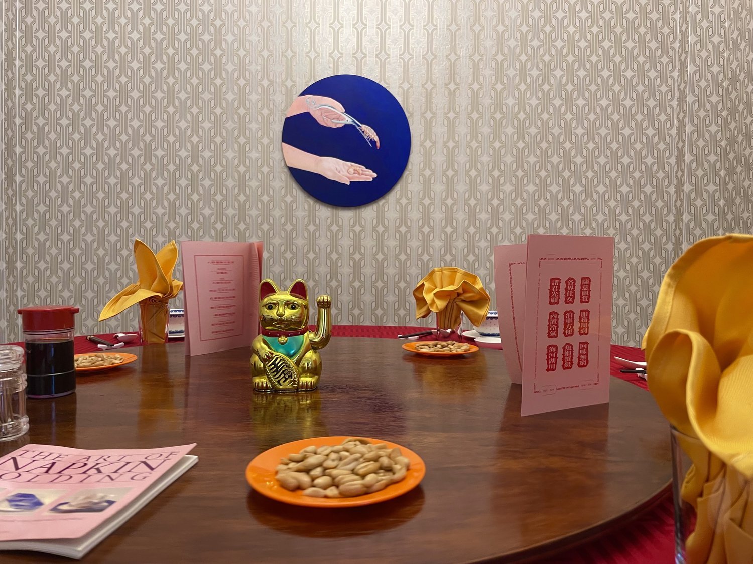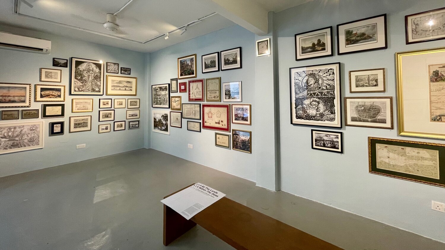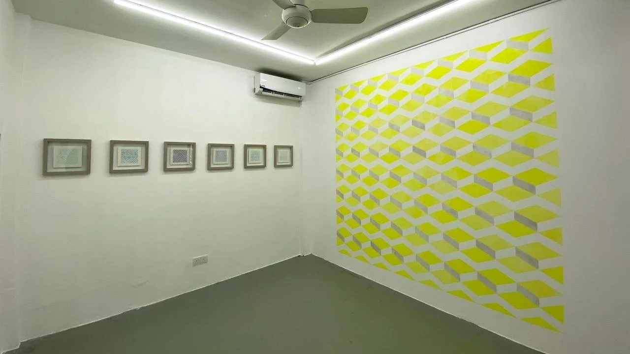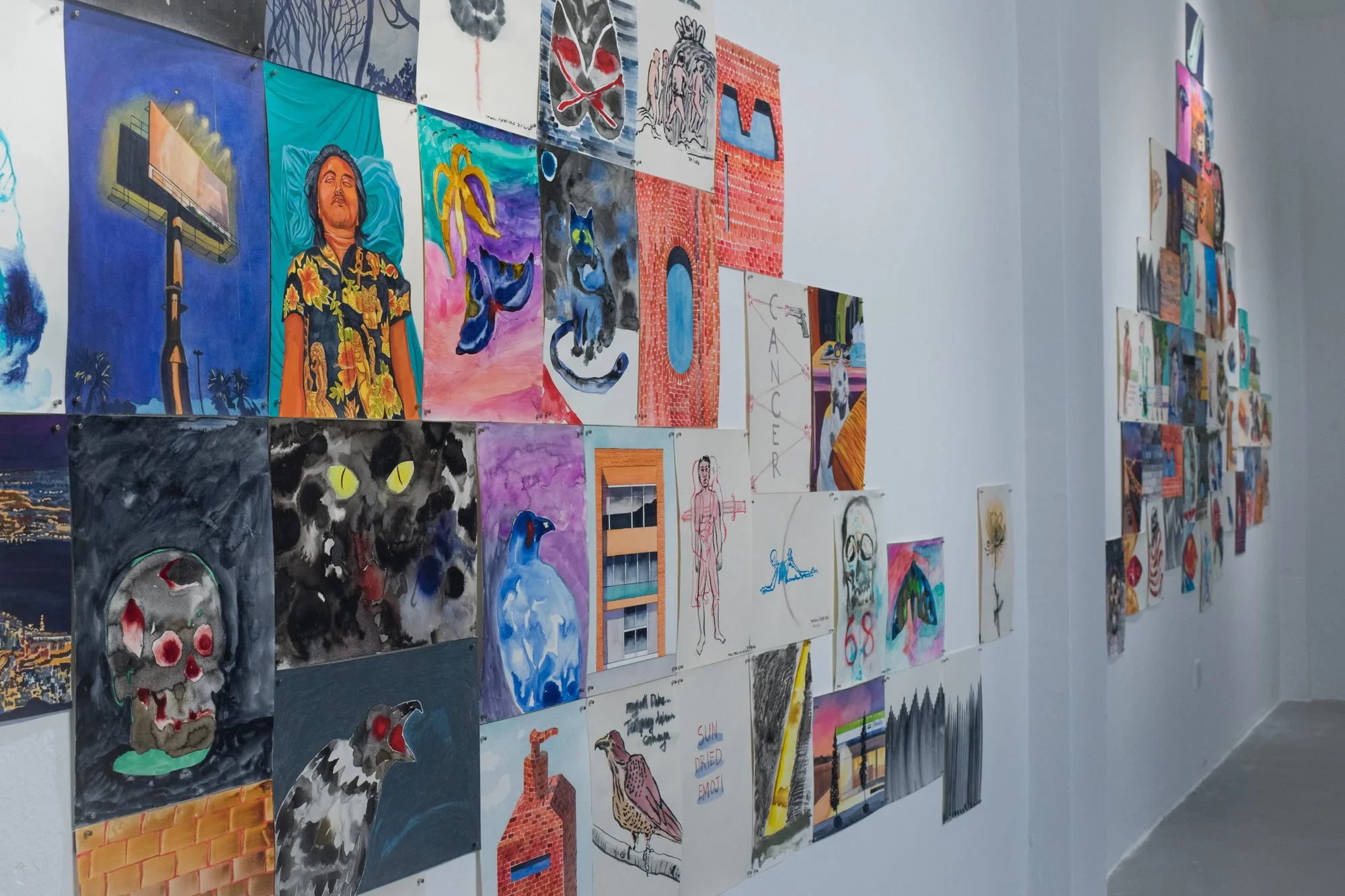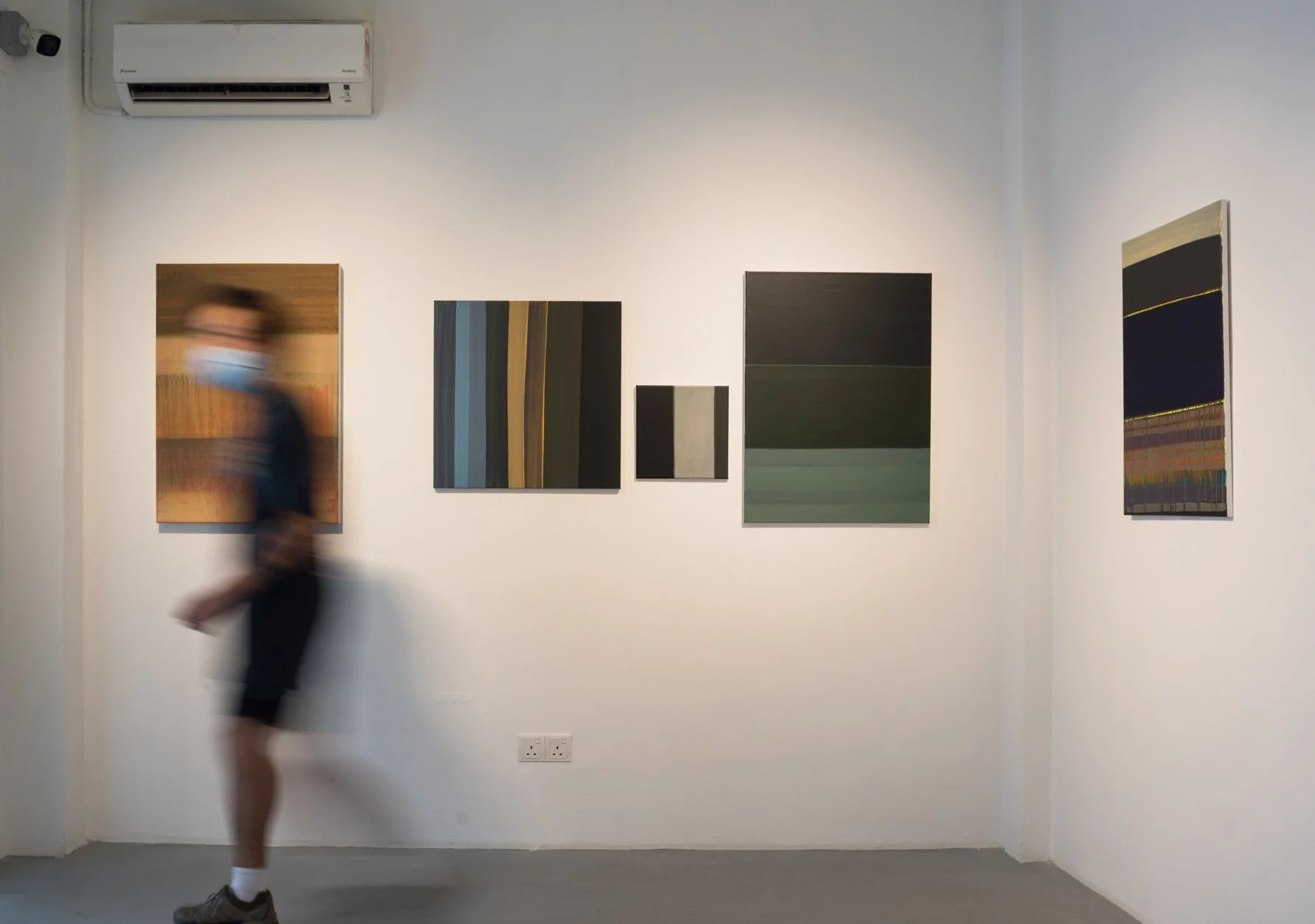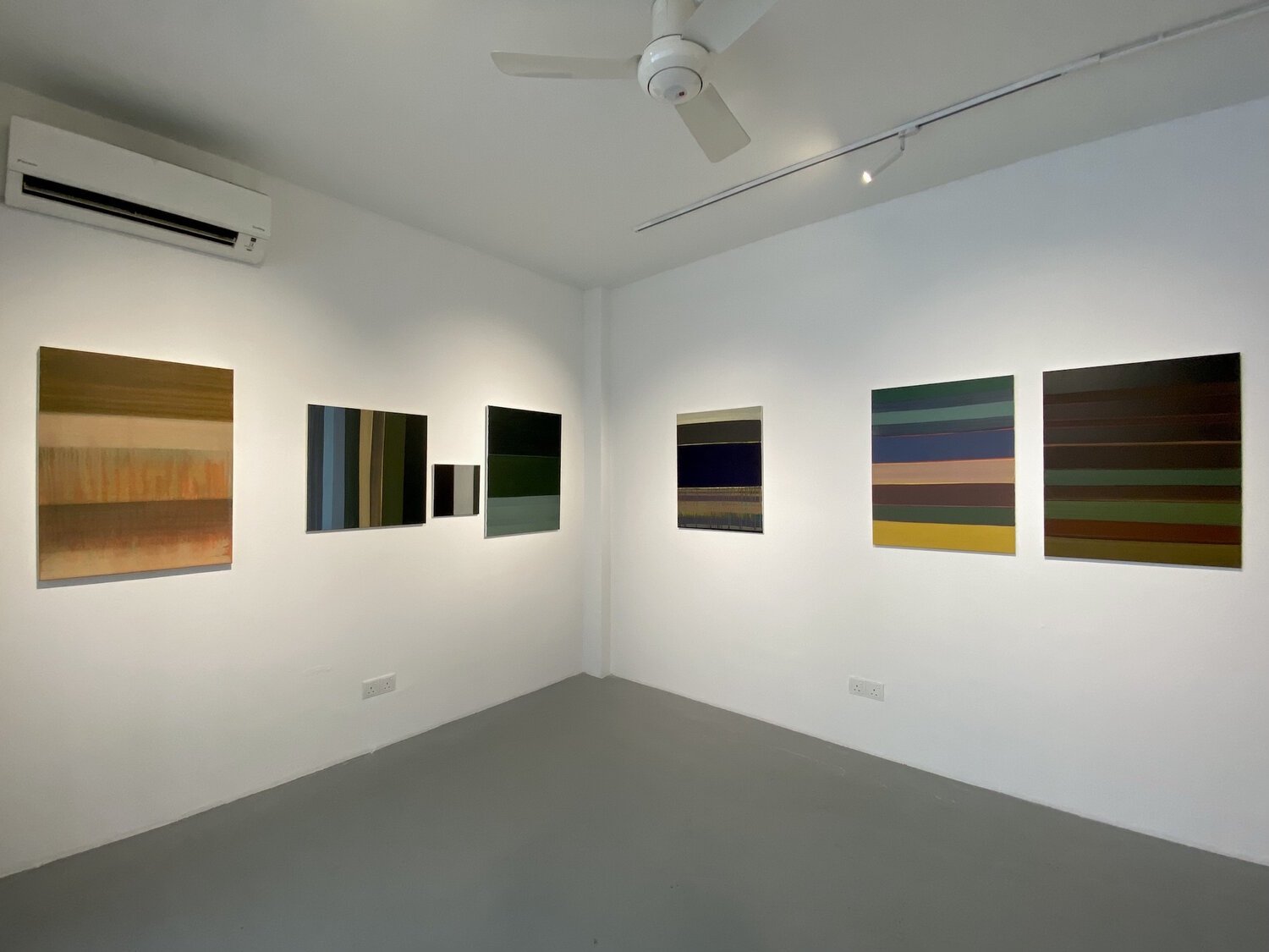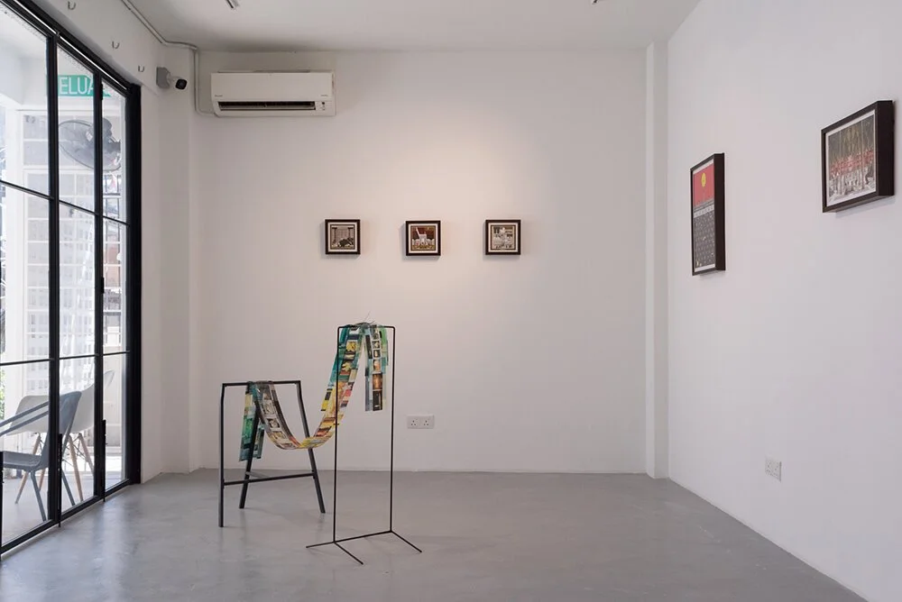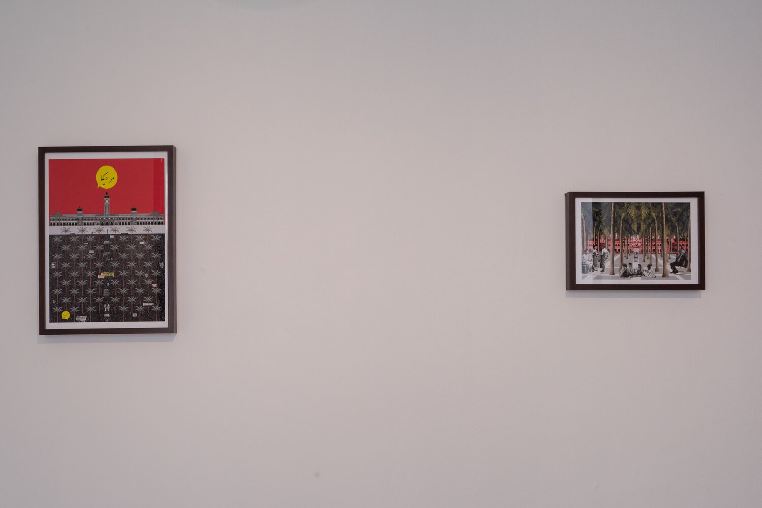
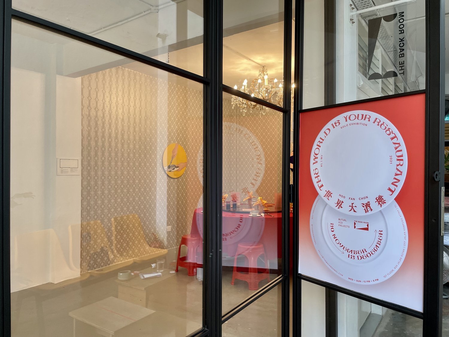
The World is Your Restaurant (世界大酒樓) by Hoo Fan Chon
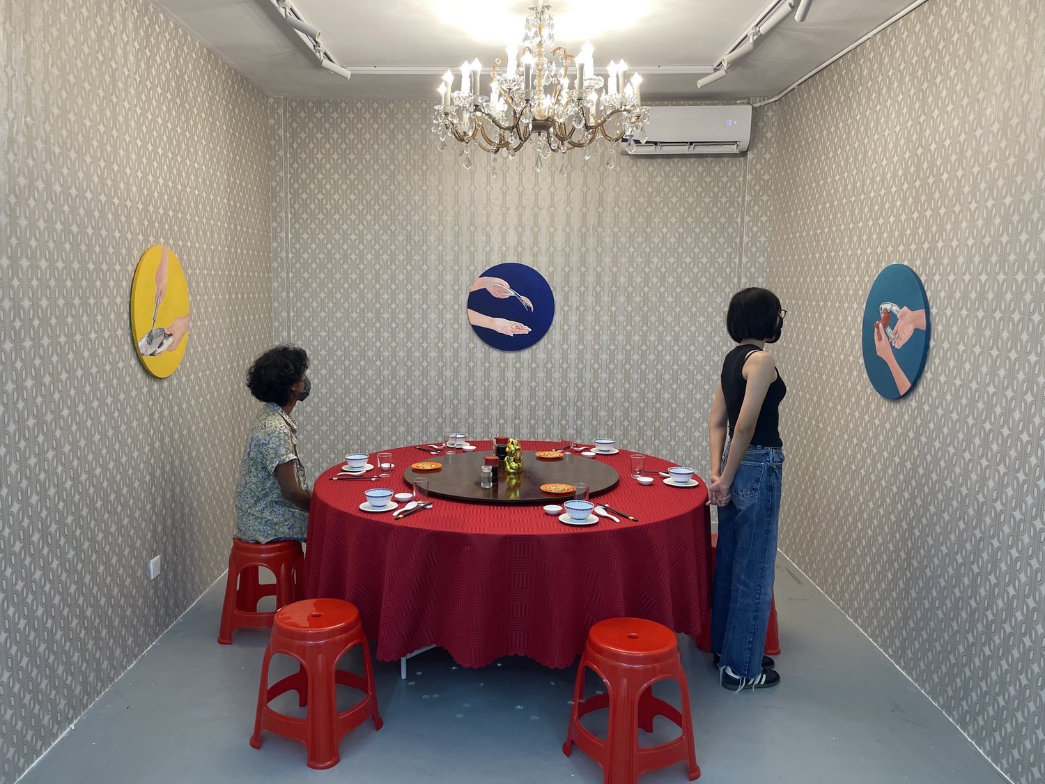
Ever the keen observer of his surroundings, Hoo Fan Chon draws attention to the kitschy aesthetics of quotidian spaces to celebrate their visual idiosyncrasies. In his youth, he was occasionally treated to lavish banquets at Chinese restaurants in Kuala Lumpur by his father. Every aspect of a meal, from the decor to the plating of dishes, was indelibly imprinted on his mind. Naturally, Hoo turns to Chinese culinary and dining culture in The World is Your Restaurant (世界大酒樓)—an exhibition that presents paintings, video, and installation art—to consider not only the visual lexicon that lends the banquet its whimsical qualities, but also the historical development of the local Sino-foodscape alongside the economic rise of KL.
This exhibition frames the banquet as a site of what anthropologist Arjun Appadurai calls “gastropolitics,” where intricate social interactions unfold over the course of a meal. As a microcosm of the world, real and ideal, it serves as a stage for some to declare their social status and for others to perform their class aspirations. In the eighties and nineties, a thriving economy drew aspiring entrepreneurs from provincial towns and prized chefs from Hong Kong to the capital city. The resulting culinary boom widened the range of dining establishments where eager customers could forge new social ties and business deals.
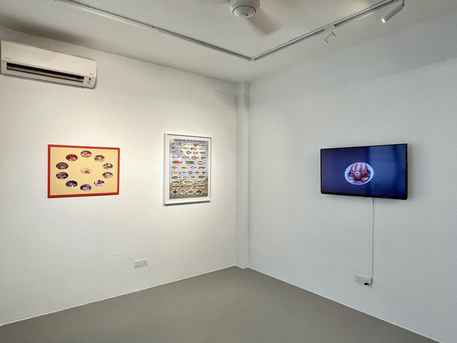
Growing up in Pulau Ketam, a fishing village off the coast of Klang, Hoo has a special affinity with fish, which is a recurring motif in his artwork. In a banquet, fish is sought after for its nutritional and symbolic values. Here, Hoo scrutinizes its classification, plating, and cooking methods to reveal the class distinctions that operate under the veneer of taste as much as man’s domineering relationship with nature. The live fish trade, which shows no signs of slowing down, is threatening the robustness of the marine ecosystem. By treating the world as a boundless feast, the rapacious man hurtles it towards an imminent ecological crisis. It would appear that we devour ourselves, as we eat to our hearts’ content.
This exhibition is jointly produced by Mutual Aid Projects and The Back Room
About the Artist
Hoo Fan Chon (b. 1982, Selangor) is an artist and curator currently residing in George Town, Penang. He is a co-founder and a member of the Run Amok Gallery art collective. He received his Bachelor’s degree in Photography from the London College of Communication in 2010 and has since exhibited locally and internationally. He was selected as one of the participants for the Japan Foundation Asia Center Curators’ Workshop in 2015-2017 and participated in the No Man’s Land Residency by the Nusantara Archive in Taiwan from 2017-2018. In 2019, he was selected for the Makassar Biennale and in 2022, he will be pursuing a residency with the SEA AiR Studio Residences for Southeast Asian Artists, organised by NTU CCA and the EU, in Helsinki, Finland. His last solo exhibition was Biro Kaji Visual George Town at Narrow Marrow, Penang.
About Mutual Aid Projects
Founded by Eric Goh in 2020, Mutual Aid Projects (MAP) is a curator-run independent art space formerly located in Wisma Central, Kuala Lumpur. It seeks to address the unique set of challenges that come with making art and curating in Malaysia, and to encourage the development of critical artistic and curatorial practices in the region.
“The World is Your Restaurant (世界大酒樓)” marks the final exhibition of MAP. It is accompanied by a publication that covers the entire curatorial project.